文章引入
今天很多人问我新年了 是不是网站也应该跟元旦一起改下 所以今天就出了这个教程 把我们网站右上角挂两个灯笼 也是非常好看 也不会影响我们网站的运行速度 行了 直接上教程。
使用教程
1.进入主题文件 找到你主题的框架文件 比如head.php 如果不知道自己问作者 下面代码放在<body>下面就好了
<!--春节代码-->
<div class="meiha"></div>
<style>
/** 梅花树 **/
.meiha {
        position: fixed;
        top: 0;
        right: 0;
        z-index: 999;
        width: 350px;/** PNG图宽度 **/
        height: 231px;/** PNG图高度 **/
        pointer-events: none;
        background: url('https://s2.ax1x.com/2020/01/21/1kBpid.png');
}
</style>
<!-- 灯笼1 -->
<div class="deng-box">
        <div class="deng">
                <div class="xian"></div>
                <div class="deng-a">
                        <div class="deng-b"><div class="deng-t">旦</div></div>
                </div>
                <div class="shui shui-a"><div class="shui-c"></div><div class="shui-b"></div></div>
        </div>
</div>

<!-- 灯笼2 -->
<div class="deng-box1">
        <div class="deng">
                <div class="xian"></div>
                <div class="deng-a">
                        <div class="deng-b"><div class="deng-t">元</div></div>
                </div>
                <div class="shui shui-a"><div class="shui-c"></div><div class="shui-b"></div></div>
        </div>
</div>
<style>
.deng-box {
        position: fixed;
        top: -40px;
        right: -20px;
        z-index: 9999;
        pointer-events: none;
}

.deng-box1 {
        position: fixed;
        top: -30px;
        right: 10px;
        z-index: 9999;
        pointer-events: none;
}
.deng-box1 .deng {
        position: relative;
        width: 120px;
        height: 90px;
        margin: 50px;
        background: #d8000f;
        background: rgba(216, 0, 15, 0.8);
        border-radius: 50% 50%;
        -webkit-transform-origin: 50% -100px;
        -webkit-animation: swing 5s infinite ease-in-out;
        box-shadow: -5px 5px 30px 4px rgba(252, 144, 61, 1);
}
.deng {
        position: relative;
        width: 120px;
        height: 90px;
        margin: 50px;
        background: #d8000f;
        background: rgba(216, 0, 15, 0.8);
        border-radius: 50% 50%;
        -webkit-transform-origin: 50% -100px;
        -webkit-animation: swing 3s infinite ease-in-out;
        box-shadow: -5px 5px 50px 4px rgba(250, 108, 0, 1);
}
.deng-a {
        width: 100px;
        height: 90px;
        background: #d8000f;
        background: rgba(216, 0, 15, 0.1);
        margin: 12px 8px 8px 10px;
        border-radius: 50% 50%;
        border: 2px solid #dc8f03;
}
.deng-b {
        width: 45px;
        height: 90px;
        background: #d8000f;
        background: rgba(216, 0, 15, 0.1);
        margin: -2px 8px 8px 26px;
        border-radius: 50% 50%;
        border: 2px solid #dc8f03;
}
.xian {
        position: absolute;
        top: -20px;
        left: 60px;
        width: 2px;
        height: 20px;
        background: #dc8f03;
}
.shui-a {
        position: relative;
        width: 5px;
        height: 20px;
        margin: -5px 0 0 59px;
        -webkit-animation: swing 4s infinite ease-in-out;
        -webkit-transform-origin: 50% -45px;
        background: #ffa500;
        border-radius: 0 0 5px 5px;
}
.shui-b {
        position: absolute;
        top: 14px;
        left: -2px;
        width: 10px;
        height: 10px;
        background: #dc8f03;
        border-radius: 50%;
}
.shui-c {
        position: absolute;
        top: 18px;
        left: -2px;
        width: 10px;
        height: 35px;
        background: #ffa500;
        border-radius: 0 0 0 5px;
}
.deng:before {
        position: absolute;
        top: -7px;
        left: 29px;
        height: 12px;
        width: 60px;
        content: " ";
        display: block;
        z-index: 999;
        border-radius: 5px 5px 0 0;
        border: solid 1px #dc8f03;
        background: #ffa500;
        background: linear-gradient(to right, #dc8f03, #ffa500, #dc8f03, #ffa500, #dc8f03);
}
.deng:after {
        position: absolute;
        bottom: -7px;
        left: 10px;
        height: 12px;
        width: 60px;
        content: " ";
        display: block;
        margin-left: 20px;
        border-radius: 0 0 5px 5px;
        border: solid 1px #dc8f03;
        background: #ffa500;
        background: linear-gradient(to right, #dc8f03, #ffa500, #dc8f03, #ffa500, #dc8f03);
}
.deng-t {
        font-family: 华文行楷,Arial,Lucida Grande,Tahoma,sans-serif;
        font-size: 3.2rem;
        color: #dc8f03;
        font-weight: bold;
        line-height: 85px;
        text-align: center;
}
.night .deng-t,
.night .deng-box,
.night .deng-box1 {
        background: transparent !important;
}
@-moz-keyframes swing {
        0% {
                -moz-transform: rotate(-10deg)
        }
        50% {
                -moz-transform: rotate(10deg)
        }

        100% {
                -moz-transform: rotate(-10deg)
        }
}
@-webkit-keyframes swing {
        0% {
                -webkit-transform: rotate(-10deg)
        }
        50% {
                -webkit-transform: rotate(10deg)
        }
        100% {
                -webkit-transform: rotate(-10deg)
        }
}
</style>
效果截图
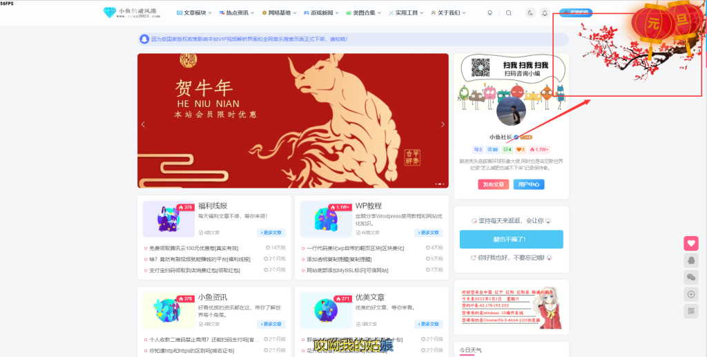
小总结
今天第一次在子比主题官方网站发表帖子 如果大家喜欢此类教程可以关注下我 日后会努力更新关于子比主题的美化教程。。。


![表情[qiudale]-WordPress主题模板-zibll子比主题](https://www.zibll.com/wp-content/themes/zibll/img/smilies/qiudale.gif)


![表情[xiaojiujie]-WordPress主题模板-zibll子比主题](https://www.zibll.com/wp-content/themes/zibll/img/smilies/xiaojiujie.gif)
![表情[doge]-WordPress主题模板-zibll子比主题](https://www.zibll.com/wp-content/themes/zibll/img/smilies/doge.gif)